SAM COX. lighting design.

ROOSTER
A detective murder mystery set in the 1940s, Rooster tackles themes of race and hypocrisy within religion. It features breaks of reality with scenes like vignettes. I aimed for a high amount of contrast to support the film noir feeling of the piece. I wanted to focus on highlighting the themes through my design. I used color to signify religious experiences and breaks of reality. I used the same colors for the Rooster and the church to symbolize that they are two sides of the same coin. The scenic designer and I also collaborated on using practical light fixtures to set the scenes.
Mitchell Hall, University of Central Oklahoma
DIRECTION:
SCENERY:
PROJECTIONS:
COSTUMES:
PHOTOGRAPHY:
MICHAEL PAGE
DEVIN SCHEEF
SKYLAR SELBY-MULLINS
REBECCA MCGUIGAN
UCO PHOTOGRAPHIC SERVICES


THE ROOSTER
-Almost religious experience- breaks reality
-Saturated blue top light
-Saturated amber side light
Additionally, I use the software Capture to test lighting angles after my initial photometrics work. The rendering below is the concept I had for lighting the auto shop, which can be seen realized below as well.
To communicate my ideas to the production team, I used simple renderings to showcase different looks. The renderings to the left are what I presented for the juke joint known as The Rooster. Above is a production photo from a scene in that setting. Below are my renderings and results for some of the church scenes.


THE CHURCH
-Religious experience- breaks reality
-Color palette same as Rooster to show “two sides same coin”
-Saturated amber wash
-Saturated blue side light
-Sharp modelling top light


PRACTICALS
In the initial design process, there were many proposed practicals. Not all of them made the final cut, but this document is a comprehensive list of the original design. Some were big projects, such as the Rooster light box, the flashlight jail and the street lamps, while others were simple hanging fixtures. Ultimately, the hotel chandeliers, church pendants, and gas lamps were not implemented. Despite the cuts, this production still utilized 12 practical lighting effects.


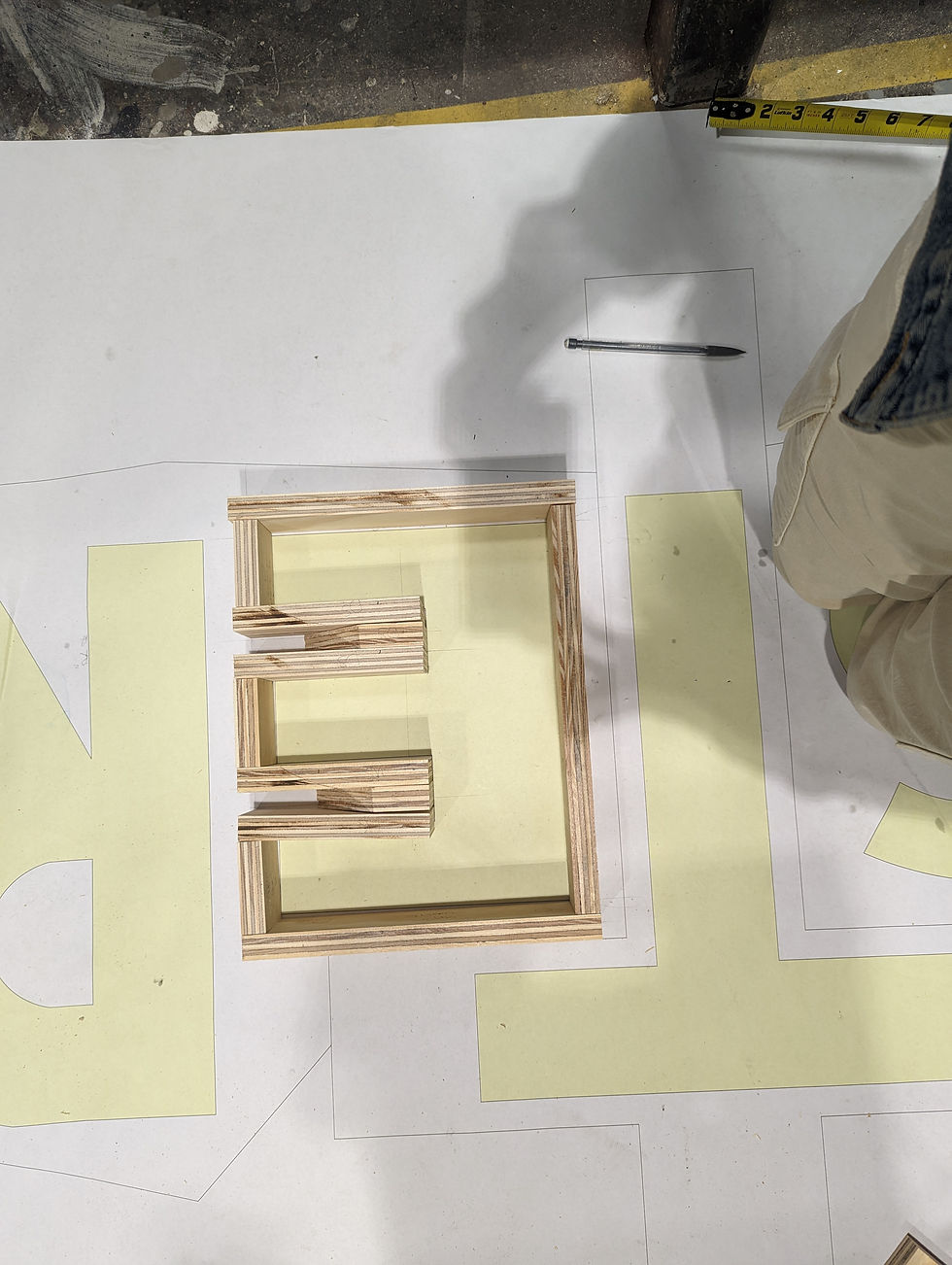
The scenic designer and I collaborated on creating the Rooster sign. We printed out a life size print of the drafting for the sign and used scrap wood and foam to build out the letters. They were then attached to the sign’s backing, which I drilled holes in to house the globe lights. I painted the insides of the letters white to maximize the brightness. We covered the letters with a fabric screen that made it so that you could only see the letters when the sign is lit up. Anytime the sign is off, it simply looks like a cross. The cross itself also has LED tape mounted to it to give a backlit effect in the church scenes.


STREET LAMPS
The assistant scenic designer and I collaborated to bring the historic Aiken street lamps to the stage. We sanded down giant plastic wine glasses to act as the cover and used tupperware and hard foam to create the upper housing. I sourced LED light bulbs that were rated for enclosed fixtures so as to not light the theatre on fire. I used scrap pallet wood to create the posts that attached the street lights to the set.


me when the casing fell off one time (it was secured eventually dw)


